Friday, July 27, 2012
Final Posters
One very important thing I learned while putting this poster together is that you should not use tacky glue on vellum. It leaves a very noticeable blob. All of my graphic design knowledge I learned really helped me create these posters. It made it much easier to figure out where to put things and how to space them. I feel like these posters portray the design process I went through while creating this seat and shelter. The one thing I like the most about these posters is how my background turned out. I spent a lot of time creating it in photoshop, so I am very happy that it looks so nice.
Thursday, July 26, 2012
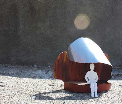
Final Model
Coming up with a design for a seat and shelter was more difficult then I thought it would be. Trying to create something functional from abstract sketches and models is definitely a new process for me. I was able to create the metal shelter from the idea of a sea shell wrapping around itself, so the idea for the bench was to have something that appeared more solid and grounded. I am really happy that I was able to make the metal in a shape that would provide shade throughout the day. To improve on this model I would have liked to make the base of the bench a bit taller, so it would look more realistic and comparable to an actual bench.
Final Abstract Model
The most difficult thing about creating this model was working with the wire. It took a good hour or two to bend it the way I wanted. Creating the rest of the model went pretty smoothly. To improve this model I would have chosen a heavier material for the base. The chip board I used is not very good at holding up heavy wire.
Sunday, July 22, 2012
Shadow Sketch
The first mistake I made with this drawing with choosing pen
over pencil. I would have been able to show shadows with more variation in
value with pencil. I do like how the shadows on the handrail turned out, even
though the rail itself looks a bit contorted. I rushed through this sketch and
did not take as much time as I should of. On a positive note I learned that I
should give myself more time when sketching to avoid rushing and missing
important details.
Proportion Sketch
I usually have a lot of trouble drawing things in
proportion, so I am quite pleased with how this sketch turned out. I get very
frustrated and disheartened when my drawings do not turn out how I thought they
would. I took more time then usual planning out this sketch in my head, so I
believe that is one of the reasons it turned out so well. Looking at this
sketch makes me feel like I am actually learning from my mistakes and my
drawing skills are improving.
Negative Space Sketch
This was a quick sketch that was not too difficult to complete. I would have added more leaves to make it more interesting now that I can see the final product. Drawing only the negative space of an object really made me focus on the shape and form of the object, and not the tiny details. I feel that this will help me in the future to pay attention to the overall shape of objects.
2-Point Perspective Sketch
I feel like I was able to show the different values of this room decently. I still think my perspectives still need work, but I am starting to improve. It was difficult for me to draw the pipes on the ceiling. I could not get them to turn out the way I wanted them to.
Perspective Sketch
Each time I draw a perspective it gets a little bit easier and makes more sense. I feel like a did a really good job creating a feeling of depth on the floor. The hallway closest to the far wall looks ok to me, but the one in the foreground looks a bit off.
1-Point Perspective Sketch
Another quick sketch that I should have spent more time on. Perspectives really frustrate me. I was too close to the door and should have backed down the hallway a bit more so that I would have had more of a space to draw.
Abstract Models
Most of these models appear very flat to me. I had a difficult time trying to make them appear three dimensional. I think I tried to make them appear exactly as I saw them in my drawings, when I should have been more flexible. I could have abstracted them even more instead of trying to make them exactly the same.
Designer Poster
Most of the time making this poster was spent trying different layouts for images and text. The quality of the images turned out really well, but I feel like the quotes I chose are floating around.
Hybrid Drawing
If I could improve this drawing, I would have chosen a better image for the brick. The size of the brick I chose is not proportional to the rest of the room. I feel like the value and color of the floor turned out well.
Saturday, July 7, 2012
Fruit Value Painting
Creating value with paint takes a lot of time and effort. It is hard to creates shadows and darker areas with paint without making it look muddy, which is what happened on my lemon. Outlining the fruit with pen really helped define its' shape.
Hand Sketch
Hands are usually difficult for me to draw, but I really think this turned out well. I tried to draw slower and think about the different lines and shadows on my hand. Drawing the object my hand was gripping also made me focus on the lines the object had, as well as my hand.
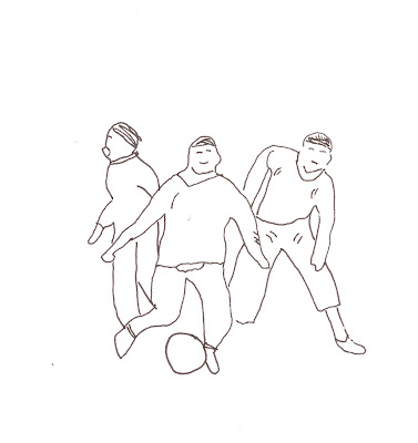
People Contour Sketch
I like that contour drawings can still show action and activity without too much detail. I chose to do this sketch in pen since a lot of detail was not needed, and I can create solid, definite lines with a pen.
Tree Contour Sketch
Sketching these trees by only showing the contour lines wasn't too difficult to accomplish, but I feel like I didn't use enough contrast in value and line weight. I found that by clustering lines together I could show which areas were denser in branches or leaves. I do like how both of these sketches turned out, but I wish I had more of an idea of how to make them better. Perhaps I could look at other examples and learn from them?
Friday, July 6, 2012
Pattern
Lining up the images was difficult for me in this pattern. Even though all the squares on the background were the exact same size, my triangles would not line up. This pattern took a long time to complete, but I feel like it turned out really well. To improve upon it I should have found images with varying visual texture, or transformed them so they appeared to be different.
Design Definition Posters
Subscribe to:
Comments (Atom)


